What is a bedroom community?
A distinctly North American term used to denote an area in which the majority of residents commute to work outside of the municipality in which they live, a bedroom community is typically thought of as a place where people go home to sleep, with the majority of professional and social activity occurring elsewhere. Bedroom communities, or “commuter towns,” are typically suburbs adjacent to nearby cities. For the purpose of this study, however, every county in the United States (urban, suburban, and rural included) was evaluated based on a unique methodology considering population inflows and outflows, retirement-age population density, and retail density. This Index, therefore, evaluates all counties based on a spectrum of “bedroom-ness,” so to speak.
The bedroom community concept has several implications related to economic development. Bedroom communities typically experience less economic activity due to residents leaving the area to contribute elsewhere. From a municipal budgeting perspective, this may lead to an unhealthy reliance upon residential tax revenues instead of a balanced mix of residential and commercial tax revenues.
While “bedroom community” is often thought of as a negative term, many residents prefer the area in which they live to reflect this aspect. Indeed, bedroom communities are quieter and often have less crime, in addition to being more affordable than urban areas.

For areas that are not content with being seen as a bedroom community, there is good news: The fact that a significant amount of residents work outside the area could be an opportunity. Demonstrating an ample labor supply that would potentially prefer working closer to home instead of enduring lengthy daily commutes can go far in terms of business attraction.
Measuring ‘Bedroomness’
While the actual methodology used to create this index is proprietary, the concept is as follows: First, the indicators were normalized to a score between 0 & 100 (0 being not like a bedroom community, 100 being very much like a bedroom community) to allow for comparison of different units. Statistical outliers were replaced with the upper or lower fences. Weighting was then applied to each score to show the relative importance of each indicator. In this case, the Outlow:Inflow Ratio was the most heavily weighted. These weighted scores were then aggregated and normalized again in order to achieve the final score and rank of each county relative to the other. The higher the score, the lower the rank; the assumption being that a county most reflective of a bedroom community is less desirable due to the majority of economic activity occurring elsewhere.
Most ‘Bedroomy’ Counties
| County/ Parish/ Equivalent |
State | MSA | Population | Population Density | Outflow/ Inflow Score |
TotalLiveIn/ TotalEmployedIn Score |
LiveInWorkOut/ TotalLiveIn Score |
Population 65+ Score |
% Industry: Retail Score |
Index Score |
| Kalawao | HI | Kahului-Wailuku-Lahaina | 91 | 7.59 | 100.00 | 99.54 | 95.78 | 77.88 | 57.24 | 100.00 |
| Loving | TX | N/A | 76 | 0.11 | 100.00 | 99.54 | 95.78 | 87.02 | 46.71 | 99.90 |
| Poquoson (city) | VA | Virginia Beach-Norfolk-Newport News | 12,068 | 787.73 | 100.00 | 99.54 | 85.67 | 52.88 | 80.92 | 98.47 |
| Dallas | MO | Springfield | 16,508 | 30.53 | 100.00 | 99.54 | 74.24 | 58.65 | 92.76 | 98.10 |
| Keweenaw | MI | N/A | 2,195 | 4.06 | 100.00 | 99.54 | 82.54 | 100.00 | 30.26 | 97.77 |
| Worth | MO | N/A | 2,061 | 7.73 | 100.00 | 99.39 | 68.06 | 82.69 | 72.37 | 97.44 |
| Taliaferro | GA | N/A | 1,904 | 9.78 | 100.00 | 99.54 | 83.03 | 74.04 | 48.68 | 97.30 |
| King and Queen | VA | N/A | 7,140 | 22.66 | 100.00 | 99.54 | 87.12 | 68.27 | 46.05 | 97.29 |
| Craig | VA | Roanoke | 5,195 | 15.76 | 100.00 | 99.54 | 74.43 | 61.06 | 76.32 | 97.12 |
| Bandera | TX | San Antonio-New Braunfels | 21,015 | 26.57 | 100.00 | 99.54 | 72.31 | 86.06 | 52.63 | 96.91 |
| Armstrong | TX | Amarillo | 1,913 | 2.10 | 100.00 | 99.54 | 82.23 | 72.12 | 46.71 | 96.91 |
| Loup | NE | N/A | 542 | 0.95 | 100.00 | 99.54 | 75.17 | 84.62 | 48.03 | 96.89 |
| San Jacinto | TX | N/A | 27,172 | 47.73 | 100.00 | 99.54 | 83.93 | 59.62 | 55.26 | 96.87 |
| Westmoreland | VA | N/A | 17,528 | 76.42 | 100.00 | 99.54 | 73.51 | 77.40 | 57.24 | 96.80 |
| Grand Isle | VT | Burlington-South Burlington | 6,945 | 84.89 | 100.00 | 99.54 | 79.03 | 49.52 | 73.68 | 96.77 |
| Lawrence | AL | Decatur | 33,433 | 48.41 | 100.00 | 99.54 | 78.03 | 44.71 | 79.61 | 96.71 |
| Jefferson Davis | MS | N/A | 11,771 | 28.82 | 100.00 | 99.54 | 77.56 | 60.10 | 63.82 | 96.61 |
| Cumberland | VA | N/A | 9,769 | 32.84 | 100.00 | 99.54 | 82.28 | 60.10 | 53.29 | 96.53 |
| Henderson | IL | N/A | 6,966 | 18.39 | 100.00 | 99.54 | 74.67 | 78.85 | 48.68 | 96.46 |
| Clay | TX | Wichita Falls | 10,367 | 9.52 | 100.00 | 99.54 | 76.47 | 66.35 | 57.24 | 96.43 |
Indicators
Five indicators were used to score and rank the counties for the U.S. County Bedroom Community Index:
- Outflow:Inflow Ratio: ratio of population living inside the county but employed outside the county (outflow) to the population employed inside the county but living outside the county (inflow);
- Ratio of population living inside the county to the population employed inside the county;
- Ratio of population living inside the county but employed outside the county (outflow) to the total population living inside the county.
- Percentage of retirement age population (65 years and above)
- Density of retail industry employment (using Location Quotients).
Why counties?
In short, counties are the most practical jurisdiction to analyze population flows on a nationwide scale. While bedroom communities are typically conceptualized at a more local level, such as towns or neighborhoods, the sheer number of these would be impractical to analyze.
Neighborhoods add an additional challenge of boundary definitions. Furthermore, reliable data becomes increasingly difficult to find for the smaller the jurisdictions. Counties offer the best mix of somewhat localized boundary definitions with reliable access to data.
Least ‘Bedroomy’ Counties
| County/ Parish/ Equivalent |
State | MSA | Population | Population Density | Outflow/ Inflow Score |
TotalLiveIn/ TotalEmployedIn Score |
LiveInWorkOut/ TotalLiveIn Score |
Population 65+ Score |
% Industry: Retail Score |
Index Score |
| Tunica | MS | Memphis | 10,407 | 22.89 | 6.06 | 9.71 | 37.74 | 17.31 | 7.24 | 11.25 |
| Northwest Arcitc | AK | N/A | 7,723 | 0.22 | 7.21 | 25.01 | 5.26 | 0.00 | 30.92 | 11.00 |
| Teton | WY | N/A | 22,623 | 5.66 | 4.37 | 20.44 | 3.83 | 23.56 | 44.74 | 10.86 |
| Oglala Lakota | SD | N/A | 14,263 | 5.14 | 4.90 | 14.09 | 16.55 | 0.00 | 56.58 | 10.78 |
| Williams | ND | N/A | 31,643 | 15.23 | 5.46 | 18.13 | 11.32 | 12.98 | 34.21 | 10.56 |
| Ketchikan Gateway | AK | N/A | 13,715 | 2.82 | 0.48 | 0.00 | 14.80 | 27.40 | 73.68 | 8.18 |
| District of Columbia | DC | Washington-Arlington-Alexandria | 659,009 | 10,794.58 | 4.31 | 9.01 | 25.20 | 21.63 | 0.00 | 8.11 |
| New York | NY | New York-Newark-Jersey City | 1,634,989 | 71,615.81 | 1.93 | 3.27 | 19.35 | 36.06 | 19.74 | 7.12 |
| Aleutian West | AK | N/A | 5,714 | 1.30 | 0.64 | 20.97 | 0.00 | 0.00 | 29.61 | 5.55 |
| North Slope | AK | N/A | 9,681 | 0.11 | 0.00 | 6.52 | 0.00 | 0.00 | 0.00 | 0.00 |
Using counties as the unit of analysis is an imperfect solution, particularly because multiple towns and neighborhoods typically thought of as bedroom communities can be located within a single county. Some counties could contain employment centers that draw labor in as well as areas that export labor. By choosing counties as the unit of measure, we inherently ignore hyper-localized commuter, living, and working patterns at the city, town, and neighbourhood level. That said, counties still offer the most practical solution for nationwide analysis as the most manageable geographic constraint.
U.S. County Bedroom Community Index
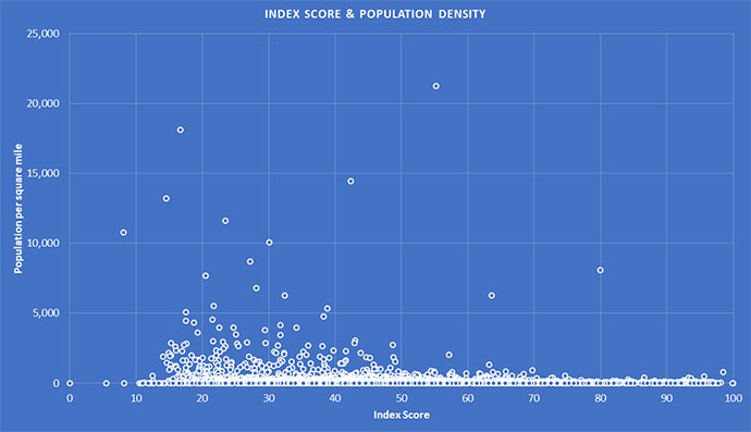
It is difficult to say if there is a relationship between population density and being a “commuter town.” As seen by the distribution of counties according to their index score and population density, many low-density counties have scores that range across the whole spectrum. That said, the figure demonstrates how most of the very high-density counties tend to have lower index scores:
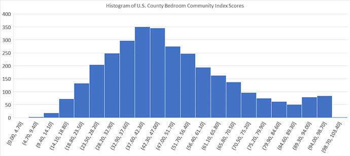
The figure below demonstrates a histogram of the U.S. County Bedroom Community Index scores. Most counties (56 percent) are massed between scores of 28 and 56. It is interesting to note that while the slope is steep on the left side of the histogram, it is more gradual toward the higher index scores on the right. A large portion (over 30 percent) of counties have an index score above 56.
Case Studies
After analyzing over 3,000 counties, certain characteristics begin to repeat themselves to reveal several distinct types of labor flows. Here are five examples that fall within the five main categories:
Inflow County
An Inflow County is one that experiences a large number of employees coming into the county to work, while residing outside the county, compared to the number of workers residing in the county and working elsewhere. These types of counties are the least emblematic of bedroom communities since the area has enough of an economic draw to siphon labor from neighboring areas. These counties are typically more economically diverse.
Example: New York County, New York
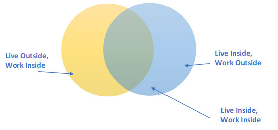
New York County (or the Manhattan borough), New York, is a well-known example of an Inflow County. As the epicenter of New York City, the county pulls in 1.7 million daily commuters with just 197,000 residents employed outside the county. Another 500,000 people both live and work in New York County.
Outflow County
An Outflow County is one that most resembles a bedroom community, since its residents are working outside the county to a far higher degree than non-residents working within the county. The figure demonstrates a large daily exodus of residents compared to a small influx of workers from outside.
Example: Blount County, Alabama
Roughly 3,700 people live outside Blount County, Alabama, but are employed in the county, while around 4,000 live and work in the county. Meanwhile, roughly 17,400 people reside in Blount County but commute to work outside the county. This large outflow is explained by Blount County’s proximity to Jefferson County, which contains the City of Birmingham.
Self-Contained County
A Self-Contained County is one where the majority of people live and work in that county, with comparatively smaller numbers of people coming in and out of the county to work. While this may point towards a more self-sufficient labor market, it might also indicate that the county is more isolated from other economies from a labor perspective. Still, it points to an efficient matchup between the area economy’s skill requirements and the resident population’s skill level.
Example: Elko County, Nevada
Roughly 16,000 people live and work in Elko County, compared to an inflow of 5,500 and an outflow of 5,500. This means that the labor market is largely self-contained, experiencing a relatively low amount of commuting. Elko County is in remote northeastern Nevada, equidistant from Boise City, Salt Lake City, and Reno. With the City of Elko being over 200 miles from any of these MSAs, the county’s largest municipality is remote, most likely explaining the self-contained labor market.
Balanced County
A Balanced County demonstrates a relatively even distribution of those who live and work in the county, those who live outside but work inside the county, and those who live inside but work outside the county.
Example: Sevier County, Tennessee
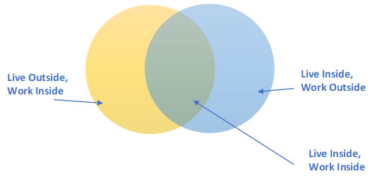
Approximately 22,000 people reside and work in Sevier County, Tennessee, with an additional inflow of 16,400 workers from outside the county and roughly 16,700 residents working outside the county. This indicates that the county labor flows are relatively balanced between sending, receiving and retaining labor. Abutting Knox County (which contains the City of Knoxville) as well as other suburban counties, there is a fluid interchange of labor.
Fluid County
A Fluid County has a very small population living and working in the county, with large (and even) inflows and outflows of workers. This dynamic is rare and difficult to explain. It could be due to labor market mismatches between resident population skills and job opportunities, as well as cost of living. For instance, a county might offer a high number of low-skilled jobs but be too expensive for low-wage workers to afford living in the area. Meanwhile, the resident population might possess higher skills and seek high-skilled job opportunities outside of the county.
Example: Sussex County, Virginia
Sussex County, Virginia, as part of the Richmond MSA, is an ideal example of a Fluid County. Only about 800 people live and work in the County, while the area receives roughly 2,700 workers from outside the county and sends 3,200 residents to work outside its jurisdiction.
Bedroom Community Index & Conway Project Database Cross-Index
We decided to cross-reference the results of the Bedroom Community Index with project data from Conway Analytics’ Projects Database, which tracks corporate end-user facility investment projects involving at least $1 million invested, 20 new jobs created or 20,000 new sq. ft. of space. We looked across all industry sectors between 2016 and 2018 in order to ascertain any relationship between the index score and project attraction rates.
Of the 1,757 counties that received project investments, their Bedroom Community Index score averaged 44.85. Of the 1,386 counties that did not receive projects, their index score averaged 53.55. Project-winning counties had an average population of 164,374 (with an average population density of 417.89), while counties without investment during the time period averaged 21,471 people (average population density of just 77.62).
Which counties hover closest to that average 164,374 population? Places like Kent County, Rhode Island (Providence); Greene County, Ohio (Dayton); Santa Rosa County, Florida (Pensacola); Aiken, South Carolina (Augusta, Georgia MSA) and Davidson County, North Carolina (Winston-Salem). The table below shows the closest 10 counties to that population figure, with Kent County, Kentucky’s Kenton County (Cincinnati) and Middlesex County, Connecticut (Hartford) coming closest to that average 44.85 Bedroom Index score. Kenton County, part of the thriving Northern Kentucky region that’s part of Greater Cincinnati, saw the most projects over the three years, with 24.
Closest to Average Population for Project-Attracting Counties
| County/ Parish/ Equivalent |
State | MSA | Population | Population Density | Outflow/ Inflow Score |
TotalLiveIn/ TotalEmployedIn Score |
LiveInWorkOut/ TotalLiveIn Score |
Population 65+ Score |
% Industry: Retail Score |
Index Score |
| Cass | ND | Fargo | 166,852 | 94.54 | 8.66 | 25.90 | 7.53 | 18.27 | 48.03 | 14.85 |
| Aiken | SC | Augusta-Richmond County | 165,146 | 154.19 | 27.96 | 38.70 | 40.27 | 50.48 | 55.26 | 36.03 |
| Kent | RI | Providence-Warwick | 164,886 | 978.38 | 33.93 | 45.80 | 59.35 | 50.96 | 71.05 | 44.82 |
| Middlesex | CT | Hartford-West Hartford-East Hartford | 164,438 | 445.27 | 38.22 | 50.39 | 61.74 | 51.92 | 53.95 | 47.43 |
| Greene | OH | Dayton | 164,325 | 397.18 | 28.21 | 39.95 | 62.67 | 41.35 | 63.16 | 39.54 |
| Davidson | NC | Winston-Salem | 164,058 | 296.85 | 60.53 | 68.40 | 63.26 | 47.12 | 49.34 | 63.51 |
| Santa Rosa | FL | Pensacola-Ferry Pass-Brent | 163,903 | 162.02 | 62.82 | 68.46 | 61.40 | 36.06 | 75.66 | 65.65 |
| Kenton | KY | Cincinnati | 163,393 | 1,019.61 | 40.10 | 53.66 | 67.08 | 27.88 | 33.55 | 46.80 |
| Maui | HI | Kahului-Wailuku-Lahaina | 162,456 | 139.87 | 78.81 | 49.98 | 23.99 | 40.38 | 57.24 | 64.49 |
| Pueblo | CO | Pueblo | 162,158 | 67.96 | 35.85 | 41.17 | 21.87 | 48.08 | 59.21 | 38.54 |
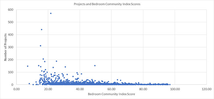
Projects preferred more populous, higher-density counties which happened to have, on average, noticeably lower Bedroom Community Index characteristics. When attempting to discover a linear relationship between projects and Bedroom Community Index score, the relationship was not strong enough to yield a robust slope (the same held true when observing projects per capita).
Project-winning counties had an average population of 164,374 … while counties without investment during the time period averaged 21,471 people.
However, when looking at the scatter graph, it is clear the counties which won significant numbers of projects had index scores of 50 or less. In fact, the vast majority of counties which had won 50 or more projects had index scores of 40 or less.
Ranked by number of projects, you have to scroll down through 72 counties to reach the first county to appear with a Bedroom Index score over 50: Fort Bend County, Texas (part of the Greater Houston metro area), with a score of 63.76 and a tally of 39 projects over the three years. Home to Sugar Land, it’s among the nation’s fastest growing, safest and most diverse counties, with a slogan that gets at that mix of business and community: “Greater Houston’s Finest Address.”
As might be expected, some other findings emerged too:
Counter-Intuitive Findings
Non-MSA counties average around the same score as MSA counties. This is most likely due to two reasons: 1) MSAs are generally balanced between a center area of economic mass and the outer-lying areas (suburbs) which send daily commuters. These county scores offset each other and bring MSA averages toward the middle. 2) Non-MSA counties can still have small cities or towns which attract labor from outside the county. They just aren’t large enough to qualify as an MSA. Also, remote rural areas could have less movement of people across county boarders due to the absence of an “economic gravity,” so to speak, so this would dampen rural county index scores as well.
Alaska counties are among the least Bedroom Community-oriented. The geographic realities of Alaska keep the populations in place. Most Alaskans live and work in the same county.
Kings, Bronx, and Queens all have low rankings. I suppose I assumed the main boroughs of NYC would not come up on the radar. But Kings, Bronx, and Queens are all on the bottom half of the 25 counties that make up the enormous New York-Newark-Jersey City MSA. Overall, they rank in the 2,000s range, which is pretty low. Looking at the data, these counties have far more people living in them than working in them, and those that live in the county tend to commute and work outside the county. Perhaps the density and connectedness of public transport enables this to occur.
A County in Transition
This is the first index, so we don’t have a series to compare. But an example of a county moving from Bedroom to Live-Work-Play is Palm Beach County. I think most people unfamiliar with the Palm Beach County area would assume it is a retirement community for the wealthy, which would certainly lend to its perception as a Bedroom Community. Even as a native Floridian, I thought this, until I took a familiarization tour of the area and was surprised by what was there.
My observations are supported by the Bedroom Community Index. Palm Beach County is ranked 609th out of 3,143 counties. (It does better than a little over 80 percent of U.S. counties in this index). More people come into the county to work than commute out of the county. Also, more people are employed in the county than live in the county. Palm Beach County does have a retirement age population of 22.7 percent when the country average is 17.5 percent, so this is probably where the perception is coming from.
Bedroom Communities with Most Economic Potential
There are several factors I would consider when trying to find the Bedroom Communities with the most economic potential. First, I would generally look at the counties that are within an MSA. These would already demonstrate a connection to the regional economy, so you’d know to some degree of certainty that the people living there would have the skills necessary to supply the economic activity of the area. (Of course, every project is different. Some projects may prefer a more rural setting).

Second, the ones with the highest share of working-age population (and therefore lowest share or population at retirement age) are more naturally advantageous for obvious reasons.
Third, if the county has higher unemployment rates than its neighbors, that may be one of the factors driving outflow of workers (less local opportunity). Especially in today’s labor market, a higher unemployment rate is actually a good thing. It means if a company were to start hiring, there’s a greater availability of workers locally.
If there’s a strong outflow of relevant skills, that is an opportunity.
Fourth, a county with a heavy outflow of workers shows an opportunity for more local employment. This could be even more important for MSAs with notoriously bad traffic and commute times, because potential employers can leverage 1) hiring more local talent, and 2) attracting talent from other areas by presenting a reverse commute option. Of course, deeper analysis would have to be done by a company looking at what sorts of skills are flowing out vs. flowing in. If there’s a strong outflow of relevant skills, that is an opportunity.
Daniel Boyer and Adam Bruns contributed to this report.