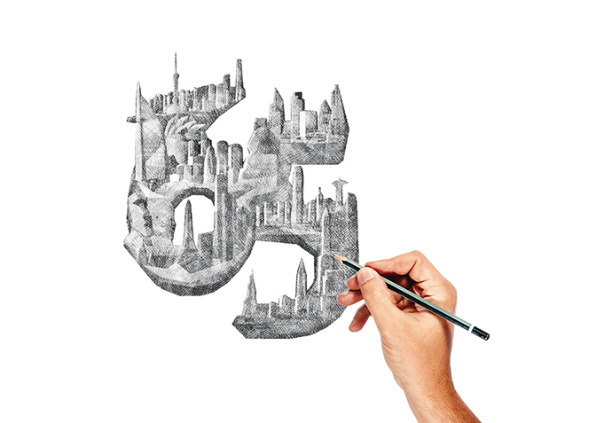
They say the phrase "aging gracefully" is just a nice way of being told you’re slowly looking worse.
We respectfully disagree. At 65, we’ve never looked better.
As the nation’s most trusted corporate expansion and FDI publication reaches an age where we don’t so much blow out our birthday candles as blast ’em with a fire extinguisher, we thought it worthwhile to reminisce about where we started, highlight some of our successes and chuckle at some of our faceplants. And, more importantly, to thank both the extraordinary men and women who create this best-in-class magazine and the corporate leaders and site consultants who trust us to help guide them in the corporate expansion and relocation process.
Three great magazines were born in 1954: Site Selection, Sports Illustrated and Playboy. We decided early on not to pressure them by competing too directly, and gave up our swimsuit issue and centerfold.
When this magazine was born, the average American could buy a new car for $1,700, a new house for $10,000 and go see a movie for 70 cents. The Dow hit a post-Depression high of 381.17. And Betty White started thinking about early retirement.
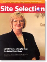
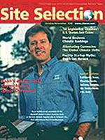
We’ve been through a lot over the years, from the booming economy of the ’80s to the collapse of 2008. Through it all one thing never changed — our commitment to excellence in journalism — and one thing did — our dogged early determination to produce some of the world’s most hideous magazine covers.
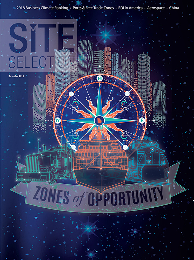
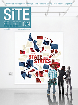
Yes, folks, for our first five decades-plus, we used our covers as a repository for head-shots of middle-aged white guys and aerial shots of piles of dirt. For sex-appeal, we sometimes tossed in a little scaffolding or backhoe. That changed in recent years when it occurred to us that a topic as exciting and varied as corporate expansion could look beautiful as well as be beautiful. We hired a top graduate, Sean Scantland, from the famed Atlanta design school The Creative Circus, and tasked him with making our venerated publication look as modern and significant as the field it covers.
It worked. Since then, we’ve quadrupled the size of our design team and won countless awards for excellence in design. We celebrate these achievements, and embrace our unpolished past, by showcasing the top 10 covers in our history, and worst five, as voted on by our teams across the world.
Site Selection has been the public face of a great company for a very long time. We stand today taller and stronger than we’ve ever been, precisely because we’ve been so willing to change, to adapt to the needs of our clients in a fast-changing world, and to never settle for good enough.
TOP 5 WORST COVERS

5TH

4TH
3RD
2ND

THE WORST
Meet the Team
We’re better than we’ve ever been because of the incredible people that make up the Site Selection family. And that’s important, because what we do is so critically important.
Wendell Phillips once said, "What gunpowder did for war, the printing press did for the mind." There’s an emotional connection to the printed word, especially when, through that word, we are connected to those who create the jobs that put food on the tables of countless families across the world. The connections we make are to those who build the R&D centers creating the technologies of the future. The connections we make are to those who make the expansion decisions so critical in sustaining economies, as evidenced by the fact that Site Selection subscriber companies have invested a staggering $2.1 trillion in new corporate facilities in the last decade alone. Talk about making a difference!
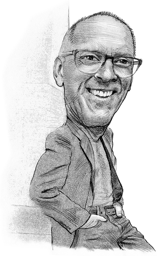
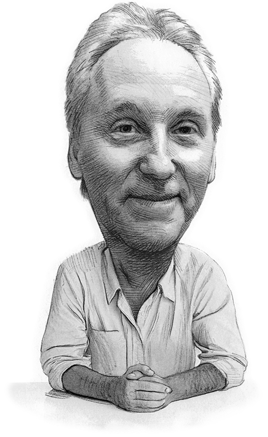
Each of us at Site Selection contributes some small part to that process. So, as we celebrate our 65th anniversary, we’d like to introduce ourselves — via these original pencil drawings by our very own in-house caricaturist/production coordinator Bob Gravlee — and say thank you. Thank you to our loyal readers, advertisers and supporters for allowing us the privilege of doing this important work, of playing our part in making that difference in the world we’ve inhabited for six-and-a-half decades.

President & Publisher


Vice President of Publications, Editor in Chief
Managing Editor

Executive Vice President

Senior Editor

Managing Editor, Custom Content

Art Director

Production Coordinator

Lead Designer

Lead Designer

Lead Designer
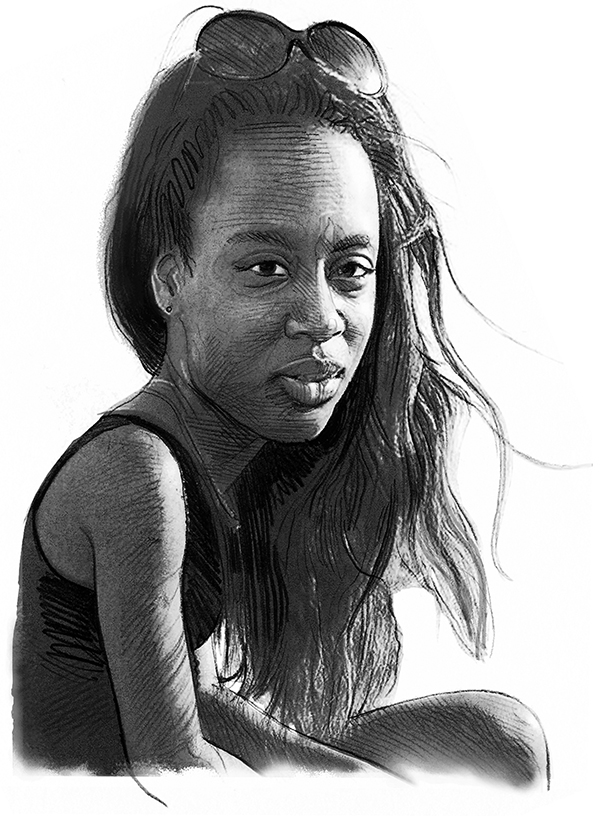
Junior Designer
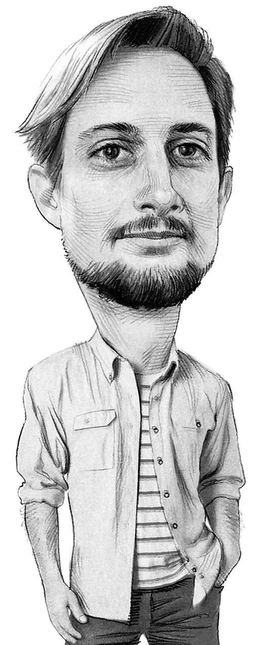
Webmaster


Circulation Manager

Editorial Database Manager


Vice President of Sales

Vice President of Corporate Development

Regional Director

Regional Director
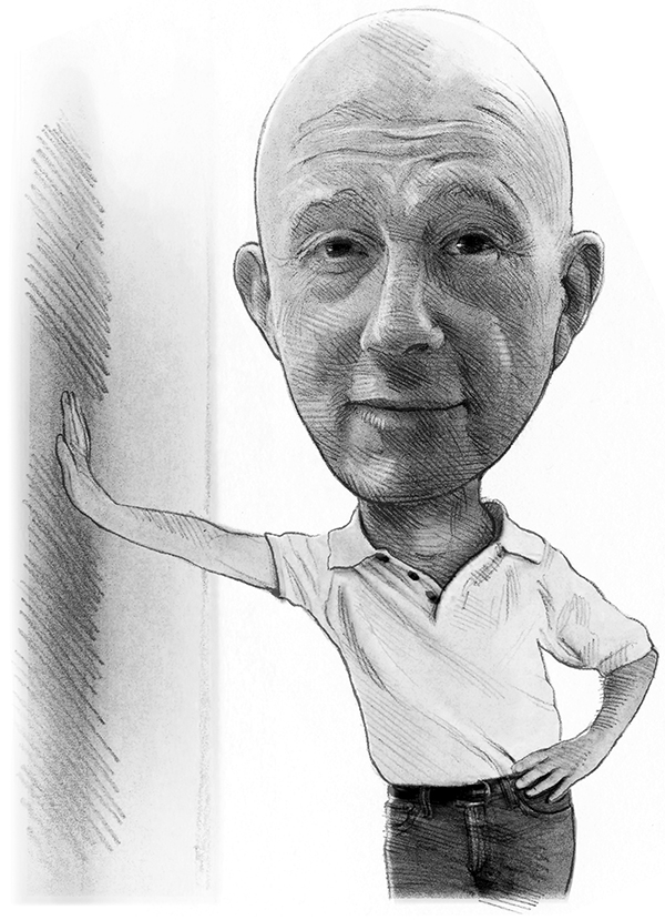
Regional Director

Regional Director

Regional Director

Regional Director

Global Director
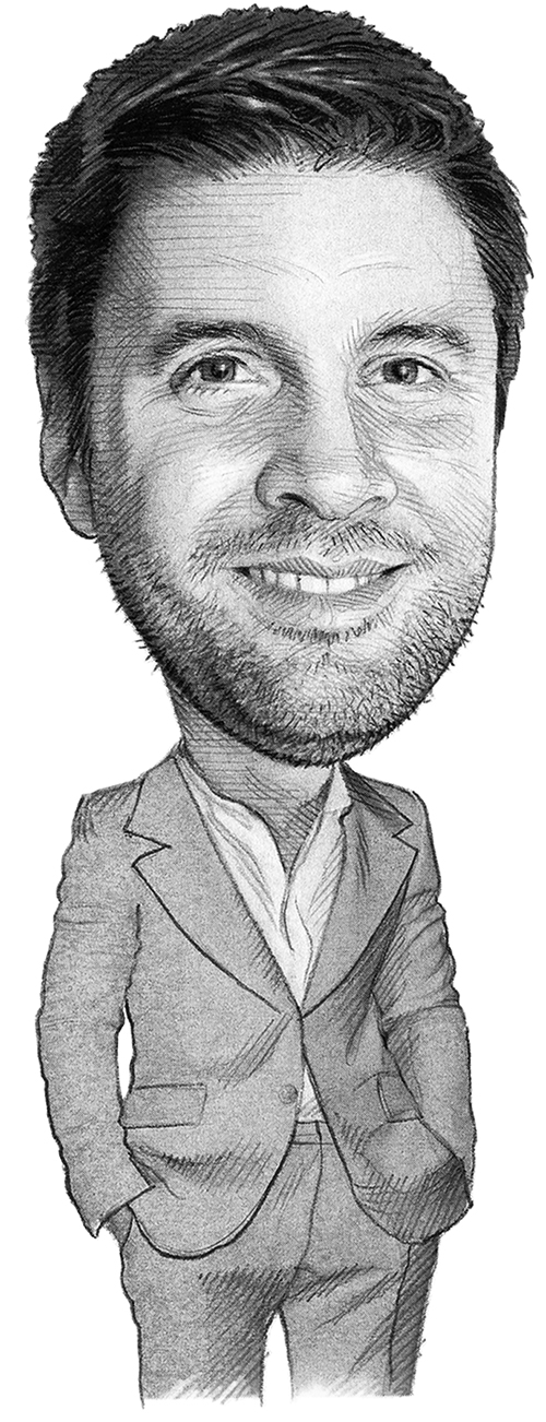
Director – Latin America

Media Representative – Korea

Country Head – China
